When the Ink Slips: Why British Film Posters Are Learning to Love the Almost
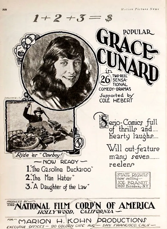
Photo: Marion H, Kohn Productions, San Francisco, California (Life time: pre-1925 image from defunct film production company), Public domain, via Wikimedia Commons
In a small print studio somewhere off a rainy industrial estate in Leeds, a designer is deliberately pulling a poster proof that most commercial clients would reject. The cyan sits a hair to the left. The title lettering has a wobble you could read as a fault or a signature. And yet, in 2026, that wobble is the point.
Illustrated film posters are having a moment in the UK. Not the glossy, algorithm-tested key art that arrives with fourteen alternate crops and a spreadsheet of test results, but the hand-drawn, screen-printed, occasionally wonky kind that looks like it was made by a person who cared enough to risk getting it wrong. Boutique cinemas from Glasgow to Bristol are commissioning them. Independent distributors are folding them into press kits. And a generation of young designers is discovering that a misregistered ink line can say more about a film than a perfectly airbrushed face.
The beauty of a bad registration
'There's a honesty to a poster that shows its own making,' says Nadia, an illustrator who has spent the last three years making limited-run posters for independent UK releases. 'When the ink sits slightly off, you can see the hand. You can see the decision. That's harder to fake than a clean gradient.'
Her latest commission — a two-colour screenprint for a low-budget British drama about a family running a fading seaside arcade — is a good example. The type is hand-lettered and slightly uneven. The central image is a pier, but the perspective is deliberately skewed. The whole thing looks as if it has been rescued from a damp drawer in a vanished cinema foyer. That's not a failure of craft. It's a mood.
Boutique cinemas have noticed. The Genesis in east London, the Hyde Park Picture House in Leeds and a cluster of volunteer-run screens in between are increasingly using illustrated posters as part of their identity. They want something that feels local, physical and human — something that says this film is an event, not a thumbnail.
From algorithm to ink
Part of this is a reaction against the way film marketing has become a branch of data science. Key art is now routinely tested, tweaked and flattened into whatever performs best across a dozen platforms. The result can be effective and completely forgettable. A poster with a visible process — a smudge, a rough edge, a colour that slipped — offers the opposite promise. It says someone made a choice and stood by it.
Distributors are cautiously buying in. Not for every release, obviously. A hand-drawn poster is a risk, and risk costs money. But for smaller films with a strong visual identity, a limited-edition illustrated run can become merchandise, a cinema giveaway and a piece of marketing that people actually want to keep. One London-based distributor told me they now budget for a short screenprint run the way they used to budget for a standard quad. It's not the main campaign. It's the souvenir of the campaign.
What a wobbly line teaches a young designer
For students and early-career designers, this revival is a quiet lesson in craft. Drawing a poster by hand means solving problems in public. You have to plan the layers, test the inks, accept that the second colour might not land exactly where you wanted. You learn that a near miss can be more interesting than a safe hit.
There's an Icarus-style thrill to it, too. You aim high, build the wings, and accept that the wax might melt on the way down. The best illustrated posters in Britain right now are not perfect. They are ambitious. They try something slightly beyond the safe edge of the brief. That is exactly what makes them worth looking at.
The economics of almost
None of this would matter if the posters didn't sell. And they do — slowly, locally, in small numbers. A run of 100 screenprints can sell out through a cinema's online shop in a week if the film has an audience. Artists are building followings. Cinemas are building identities. Distributors are getting something that behaves less like advertising and more like a cultural object.
The catch is that it doesn't scale like a digital campaign. You can't A/B test a hand-pulled print into existence. You have to trust the image. That trust is the whole point. In a market obsessed with optimisation, a wonky poster is a small act of defiance.
Aim high, land crooked
So what should you look for in this new wave? A poster that looks like it belongs to the film, not to a platform. A poster with a fingerprint in the margin. A poster that makes you want to see the film and keep the paper.
Britain has a long history of design that values wit over polish, from wartime public information posters to the best of the independent record sleeves. The current crop of illustrated film posters is part of that lineage. It is not about being sloppy. It is about being present. In 2026, that feels like something worth paying attention to — and maybe worth pinning to the wall.