The Two Minutes Before Everything: Inside British Film Title Design
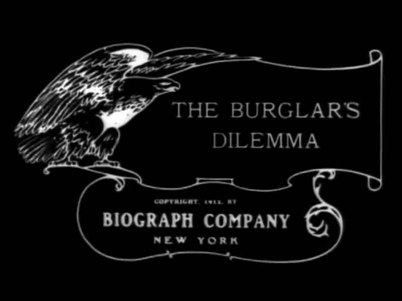
Photo: D. W. Griffith (director); G. W. Bitzer (cinematographer), Public domain, via Wikimedia Commons
You are sitting in the dark. The certificate card has gone. What happens in the next ninety seconds will decide, more than any line of dialogue, how you feel about the next two hours. A title sequence is a promise made in advance of the evidence — and Britain, for reasons that are partly industrial and partly temperamental, has been unusually good at making them.
Two minutes of trust
A title sequence has an unglamorous job description and an enormous brief. It must establish tone, deliver names to people who will not remember them, buy time for the production to shift from the real world into the film's world, and do all of it without boring anyone. Get it right and the audience leans forward. Get it wrong and you have spent a fortune teaching them to settle back and check their phone.
It is also, structurally, the only part of a feature where design is allowed to be the star. Nobody in the sequence has to act. Nobody has to hit a mark. It is pure graphic thinking at twenty-four frames a second.
Painted glass and the painterly start
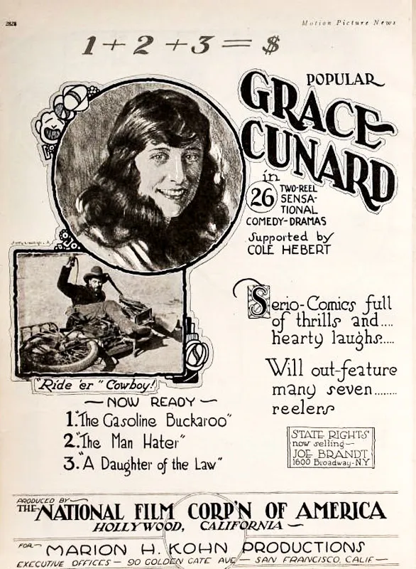
The craft here is older than most people assume. Long before computer type, British cinemas were running title cards hand-lettered on glass and photographed frame by frame — small, exquisite objects made by signwriters and illustrators whose names rarely appeared anywhere. Studios kept in-house art departments that could letter a card, paint a backdrop and build a title in the same afternoon.
The tradition of the painted title never quite died in Britain; it just moved sideways into animation. The generation that came through Halas and Batchelor and the post-war animation houses, and characters like Bob Godfrey working with marker pens and cel, carried a very British instinct into the title world: wit over spectacle, hand over polish. A wonky line was a voice, not a mistake.
Soho, small studios and the British specialism
The other reason this country punches above its weight is boringly practical. London became a place where a director could walk into a small studio in Soho with an idea and a modest budget and walk out with something remarkable. Post-production clustered, talent clustered with it, and the title sequence became a freelance specialism rather than a department of a large effects house.
That produced a lineage worth knowing. Robert Brownjohn, American-born but working out of London, projected type onto moving bodies in the early Bond films and made the letters themselves the action. The Bond franchise then stayed in British hands for decades, with Daniel Kleinman's London studio work defining the look of the series from the mid-nineties onwards — flame, silhouette, liquid, the almost-erotic choreography of a song and a graphic. Meanwhile London shops such as Momoco and the animation studios around Nexus built title work for international features while sitting firmly inside the UK industry.
It is a model of small, authored studios rather than vast pipelines. And it is why a surprising number of the sequences you can picture in your head were drawn in a room off Wardour Street.
What a sequence actually does
Strip away the style and every good title has to solve the same handful of problems.
It sets the rules. A sequence tells you whether the film is a caper, a lament or a warning, and it does so before it has told you anything about the plot. The typeface alone can do it: a condensed grotesque is a different genre from a hand-painted brush script, and everyone in the audience knows it without knowing they know it.
It manages time. A title sequence is a bridge. Some films need a long walk across it, some need to be thrown over the gap. Knowing which is an editorial instinct, not a design one.
It protects the story. In a practical sense, those minutes let a film open somewhere unexpected, or leap years in time, or avoid a clumsy first scene of exposition.
It withholds. The best ones show you a texture without showing you the plot. They are trailer-adjacent but honest — mood, not spoiler.
The 2026 toolkit is not the point
Every few years the tools change and the conversation becomes about the tools. Right now that means real-time engines, procedural type, AI-assisted roto and enormous libraries of plugins. All useful. None of it is the craft.
The craft is in the boards and the timing. A young designer who can draw a twelve-frame staircase of type positions, who understands why a letterform should arrive on the beat and not a frame earlier, and who can argue for a title that carries one idea rather than four — that person is employable in any decade, with any software.
The most reliable education in the country is still sitting in a cinema with a notebook. Watch the first three minutes of a British film from each decade since the war and track what the type is doing, where the cuts land, how the sound is mixed. The BFI National Archive holds design materials and printed ephemera that repay a day of browsing, and the credits themselves are a map: pick a name, follow it, see what else they made.
Where a young designer should start
Make a sequence for a film that does not exist. Give yourself ninety seconds and one idea. Then make it again with a single restriction — one typeface, one colour, one move — and notice how much better the restriction makes it. Send it to the small studios rather than the big ones; the British title world is still built on a conversation between a director and a designer who can draw.
Because that is the thing the industry has known since the days of the painted card. The opening is not decoration added at the end. It is the first scene, in a different language — and somebody in a small office in London is writing it right now.