Folded, Stamped, Legible: The Quiet Craft of Britain's Festival Print
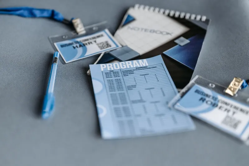
There is a particular sound a festival makes at about four in the afternoon on day three. Not the projector, not the Q&A applause — the rustle. Hundreds of folded programmes being yanked out of tote bags and coat pockets at once, all of them slightly softened at the spine, all of them carrying a week of somebody's cinema inside them.
That sound is the thing the designers we spoke to keep coming back to. Not the poster, not the social assets, not the wrap video with the good song. The programme. Because a programme is the only piece of a festival's identity that has to work in the rain, in a dim stairwell, in a queue that is moving faster than you are.
A grid is just a timetable with a pulse
Spend any time in a festival design studio in late summer and you will notice the walls. Edinburgh, Sheffield, a converted workshop in Hackney with a kettle that has clearly seen things — the walls all look the same. Six or seven grids, taped up, annotated in pencil, argued over.
What is being argued about is rarely decoration. It is sequencing. A festival schedule is a brutal little data problem: hundreds of screenings across a dozen venues, each one with a runtime, a strand, a ticket status, an accessibility note, and a start time that will almost certainly shift. The designer's job is to make that legible without flattening it into a spreadsheet.
The better programmes do something quietly clever. They put the day in the margin and the vibe in the body. You can scan for a time and still catch, out of the corner of your eye, that the 21:40 screening is a late-night psychodrama in the smaller room. Sheffield's documentary crowd and Edinburgh's late-night crowd want completely different things from a page, and the good studios know it — one wants density and cross-referencing, the other wants to be seduced by a single image.
Paper that behaves in a coat pocket
Here is the unglamorous truth of festival design: the stock matters more than the typeface. A 130gsm silk looks magnificent on a desk and turns to damp tissue by Saturday. A bulky uncoated board prints beautifully and refuses to fold without cracking down the spine.
Most of the designers we spoke to have settled somewhere in the middle — a 100 to 120gsm uncoated, slightly warm, that takes ink generously and survives being sat on. Two or three are experimenting with recycled stocks that have visible fleck in them, which sounds like a compromise until you see it under a lamp, where the fleck reads as texture rather than imperfection.
Then there is the lanyard pass, which is its own small design discipline. It has to be readable at arm's length by a volunteer in a black T-shirt at eleven at night, it has to not tear at the punched hole, and it has to look good in a photo somebody takes of themselves outside the venue. That last requirement is not vanity. It is the whole marketing budget.
Legibility is a lighting problem
Ask a festival designer what keeps them up at night and you will not hear about kerning. You will hear about bulkheads.
The reality of venue lighting is that your beautiful mid-grey secondary type will disappear entirely in a corridor lit by a single energy-saving bulb. Festival print is read in the worst conditions British architecture can offer: foyers, stairwells, the bit by the bar where the light is amber and everything goes the colour of a chip. Designers talk about contrast ratios the way sound engineers talk about headroom.
Hence the quiet return of the heavy weight. Bold day headers. Rules that hold a page together when you are squinting. Icons that read at a glance rather than requiring study — a clock, a wheelchair symbol, a little star for the thing you absolutely should not miss. The best of it looks effortless and is essentially a safety system.
The 2026 turn: print less, mean more
This year the conversation has shifted. Several festivals have cut their programme to a slimmer core booklet plus a single loose-leaf day sheet, reprinted each morning. Others have moved to a reusable cover — a sturdy card wrap, designed once, into which a cheap inner section slots each year. The cover becomes the identity; the innards become the disposable bit.
It is partly an environmental argument and partly a financial one, and the designers are honest that it is also an aesthetic opportunity. A cover that returns year after year starts to behave like a record sleeve or a matchbook — a collectible object rather than a piece of waste. One studio described the aim as making something people would feel slightly guilty about binning. That is a good test for any piece of print.
The awkward part is the schedule itself, which is now essentially a live document. Print cannot update. So the booklet increasingly carries the shape of the week — the strands, the venues, the big events — and quietly hands the minute-by-minute truth over to the app or the wall poster. The paper stops pretending to be the database and starts being the atmosphere. Which, honestly, is what it was always best at.
What ends up on the fridge
At the end of the week, most of those programmes go in the recycling. A few do not. They get flattened out on a kitchen table, the corner soft from a coat pocket, a coffee ring near Sunday, and they stay there until the following spring.
That is the strange brief these designers are actually working to. Not 'communicate the schedule' but 'survive the week and earn the fridge'. A grid that held, a paper that behaved, a page you could read in a stairwell at midnight. Small engineering, big feeling — the same bargain cinema itself keeps making, one fold at a time.